Managing a remote design team
PREPARE YOUR ART DEPARTMENT TO WORK REMOTELY
In a post- COVID 19 world, remote workers and distributed teams will be more commonplace than before. In the sign and graphics industry, the art departments or graphic designers are the perfect candidates to allow to work from home. But to do so effectively they’ll need a few tools and processes:
A project management tool like Trello, Corebridge, or Basecamp should be at the top of every art department’s list. My personal favorite — and what we run Letterbox on — is ManyRequests. With a distributed team, having a central repository for all assets, notes, files, and conversations surrounding a particular project is not only important, it’s absolutely essential. It is the foundation on which you’ll build the rest of your team’s tool-set.
An online messaging app like Slack, Google Hangouts, or Microsoft Teams will be critical for your remote team. A program like this will allow your entire team to stay connected, to easily discuss projects or ideas, share images or files, or just talk about the great movie they watched last night. Zoom, Google Meetings, or Go To Meeting are also important tools for remote teams. Sometimes messaging in Slack isn’t enough and you need to have a face-to-face meeting with your teammates, or maybe even your customers, so these apps are great to turn to in those cases.
Zoom, Google Meetings, or Go To Meeting are also important tools for remote teams. Sometimes messaging in Slack isn’t enough and you need to have a face-to-face meeting with your teammates, or maybe even your customers, so these apps are great to turn to in those cases.
A screen-recording app like Soapbox or Loom really comes in handy when you need to record a quick, narrated video to explain something or offer feedback when a full web meeting isn’t required.
Get Organized
Whether your team works remotely or continues to report to the office, chances are you’re experiencing a bit of a slow- down in your design department’s workload. Use that time to tackle some serious organization projects you’ve been cutting off for far too long.
Get your file management system under control.
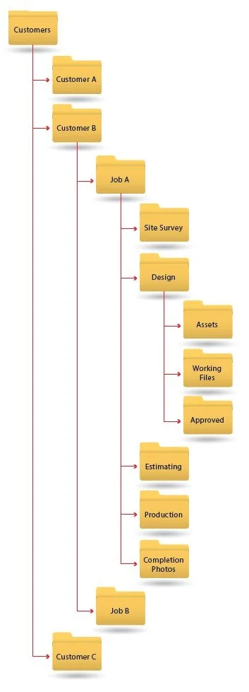
If your design department is like so many others, file management is probably an afterthought. Now’s the time to create a new system or process for storing all of the assets (photos, notes, emails, design files, etc.) for each job in a more organized manner.
Create a standardized file structure template and deploy it for each customer, organizing all of their files and archiving or deleting unnecessary files in the process.
Get rid of old samples and catalogs from vendors or for products you no longer use. Organize the things you keep, and store them so it’s easy for you and your designers to find what they need quickly and efficiently.
Do you have a lot of specific design elements you use regularly - like channel letter section drawings, attachment detail drawings, certain types of shirts you use for proofs? If so, spend some time standardizing how these all look, and organize and catalog them so all of your designers have easy access to these. This will make their jobs much easier and more efficient, and the work your team produces will be more consistent.
GIVE YOUR PRESENTATIONS A MAKEOVER
Whether you sell signs, wraps, apparel, printing, or promotional products - the way you present proofs or design work to your customers directly impacts your bottom line. If your customer has solicited designs from multiple vendors, the company with the most professional and impressive presentation has the highest chances of winning the bid. Even if their product is no better - or substandard - compared to their competitors. Poorly designed presentations, full of spelling mistakes, amateurish arrangement of graphics, and inaccurate, vague, or missing specifications turn customers or potential customers away immediately. It undermines their confidence in their choice of vendors, both for the current project and any potential future projects.
Do you use the proofing process as an opportunity to up-sell by offering additional options to your customers? If not, you should. But don’t expect your customer to buy more if those options aren’t presented in a visual way that makes it hard for them to say “no.” Is your proof sheet or title block impressive? Does it scream “professional” or does it look like a 12 year old threw it together in MS Paint? Ask yourself if you wouldbe impressed to receive this from your vendor, or would it make you concerned about the quality of the product that is coming soon after? Do you even have a consistent form or process when sending proofs?
Now is a great time to give your approach to presenting your products to your customer a makeover. Take a look at what some of your competitors are putting out in the market, and what some of the “gold standard” companies in your industry do. Step back from your niche and look at how other companies present drawings to their customers for approval. Architects, builders, and marketing and design firms are great places to look for inspiration.
Add a cover page on all of your proofs, with the customer’s logo, a brief project description, date, version, plus some sort of imagery that conveys a sense of what’s inside. Even for small orders, spending a little extra time on a cover gives your customer a sense that this is an important project, and even the presentation of the design is part of the finished product.
If your proofs include a lot of technical drawings (common for the sign industry especially), spend some time looking at how architects label and call out details on their blueprints. Devise your own method of labeling each part of the drawing, calling out colors, materials, and other specifications like numbering pages. These drawings have to simultaneously look visually appealing to make the viewer excited about the product, but they must also convey a lot of detailed information in a clear and concise manner that any person outside of your industry will still be able to understand it.
LEARN NEW SKILLS OR TOOLS
Nobody really knows exactly what this industry will look like once the dust settles from COVID-19, but it’s safe to say that there will be fewer businesses competing for a smaller piece of an evolving pie. Inevitably that means that in order to maintain some competitive advantage, businesses will have to be nimble to adapt to changing industry trends.
What does that mean for you? That may entail aggressively honing your design skills so you are always better than the competition. Or it may mean it’s time to take up the challenge of learning that new 3D modeling software or digitizing application because those are things your competition can’to . Find a way to set yourself apart from your competition by expanding your skills, and learn new tools.
FOCUS ON WHAT YOU’RE GOOD AT
Most small business owners have a tendency to fall into the “jack of all trades” category. That mentality can trickle down to most areas of the business, including the design department. This can potentially be a recipe for disaster.
In design, it’s usually difficult to be a true jack of all trades. Designers tend to specialize in one area: apparel design, branding, signage and wayfinding, vehicle wraps. Asking them to design things outside their comfort zone isn’t always the best way to leverage your team. If you sell vehicle wraps but occasionally you sell a channel letter sign, asking a wrap designer to design a channel letter sign is an unrealistic request. They may be able to scrape something together, but is that really the best use of your designer’s time?
If you lack the expertise in-house, spend some time researching firms or designers and find a few that align with the products you sell. Try subcontracting some design work and they can become an extension of your art department. Now you can offer high quality designs for all of your products, while also allowing your in-house team to do what they do best.


